Color wheel
From Wikipedia, the free encyclopedia

A color wheel or color circle is an organization of color hues around a circle, showing relationships between colors considered to be primary colors, secondary colors, complementary colors, etc.
Artists typically use red, yellow, and blue primaries (RYB color model), so these are arranged at three equally-spaced points around their color wheel.[1] Printers and others who use modern subtractive color methods and terminology use magenta, yellow, and cyan as subtractive primaries.
Color scientists and psychologists often use additive primaries, such as red, green, and blue, and often refer to their arrangement around a circle as a color circle, as opposed to a color wheel.[2]
The arrangement of colors around the color circle is often considered to be in correspondence with the wavelengths of light, as opposed to hues, in accord with the original color circle of Isaac Newton. Modern color circles include the purples, however, between red and violet.[3]
Intermediate and interior points of color wheels and circles represent color mixtures. In a paint or subtractive color wheel, the center is usually (but not always[4]) black, representing all colors of light being absorbed; in a color circle, on the other hand, the center is white or gray, indicating a mixture of different wavelengths of light (all wavelengths, or two complementary colors, for example).
Some sources use the terms color wheel and color circle interchangeably,[5][6] though the one term or the other may be more prevalent in certain fields or certain versions as mentioned above. Some reserve the term color wheel for mechanical rotating devices, such as color tops or filter wheels. Others classify various color wheels as color disc, color chart, and color scale varieties.[7]
Contents |
[edit] History
An in-depth history of the color circles, wheels, spirals, triangles, charts, and other order systems has been published, as a chapter of an e-book, by Sarah Lowengard, focusing on the eighteenth century.[8]
[edit] Colors of the color wheel

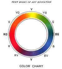
Typical artists' paint or pigment primary colors are blue, red, and yellow. The corresponding secondary colors are green, orange & violet. The tertiary colors are red–orange, red–violet, yellow–orange, yellow–green, blue–violet and blue–green.
A color wheel based on RGB (red, green, blue) or RGV (red, green, violet) additive primaries has cyan, magenta, and yellow secondaries (cyan was previously known as cyan blue). Alternatively, the same arrangement of colors around a circle can be described as based on cyan, magenta, and yellow subtractive primaries, with red, green, and blue (or violet) being secondaries.
Most color wheels are based on three primary colors, three secondary colors, and the six intermediates formed by mixing a primary with a secondary, known as tertiary colors, for a total of 12 main divisions; some add more intermediates, for 24 named colors. Other color wheels, however, are based on the four opponent colors, and may have four or eight main colors.
Goethe's Theory of Colours provided the first systematic study of the physiological effects of color (1810). His observations on the effect of opposed colors led him to a symmetric arrangement of his color wheel, "for the colours diametrically opposed to each other… are those which reciprocally evoke each other in the eye." (Goethe, Theory of Colours, 1810 [9]). In this, he anticipated Ewald Hering's opponent color theory (1872) [10].
[edit] The color circle and color vision
A color circle based on spectral wavelengths will appear with red at one end of the spectrum and violet at the other, and with a wedge-shaped gap representing colors which have no unique spectral frequency; these extra-spectral colors, the purples, are rather formed by the additive mixture of colors from the two ends of the spectrum.
In normal human vision, wavelengths of between about 400 nm and 700 nm are represented by this incomplete circle, with the longer wavelengths equating to the red end of the spectrum. Complements are located directly opposite each other on this wheel. These complements are not identical to those in pigment mixing (such as are used in paint), but when lights are additively mixed in the correct proportions will appear as a neutral grey or white.[11]


The color circle is used for, among other purposes, illustrating additive color mixture. Combining two colored lights from different parts of the spectrum may produce a third color that appears like a light from another part of the spectrum, even though dissimilar wavelengths are involved. This type of color matching is known as metameric matching.[12] Thus a combination of green and red light might produce a color close to yellow in apparent hue. The newly-formed color lies between the two original colors on the color circle, but they are usually represented as being joined by a straight line on the circle, the location of the new color closer to the (white) centre of the circle indicating that the resulting hue is less saturated (i.e., paler) than either of the two source colors. The combination of any two colors in this way will always be less saturated than the two pure spectral colors individually.
Objects may be viewed under a variety of different lighting conditions. The human visual system is able to adapt to these differences by chromatic adaptation. This aspect of the visual system is relatively easy to mislead, and optical illusions relating to color are therefore a common phenomenon. The color circle is a useful tool for examining these illusions.
The display of colors using spectral colors around a circle in order to predict the admixture of light can be traced to work by Sir Isaac Newton. The psychophysical theory behind the color circle dates to the early color triangle of Thomas Young, whose work was later extended by James Clerk Maxwell and Hermann von Helmholtz). Young postulated that the eye contains receptors that respond to three different primary sensations, or spectra of light. As Maxwell showed, all hues, but not all colors, can be created from three primary colors such as red, green, and blue, if they are mixed in the right proportions. The Young–Helmholtz theory is still seen as the most effective in modeling human color vision,[citation needed] though the color vision system is far more complex than differences in the retina alone, with different cells in the lateral geniculate nucleus also responding in opponent fashion to complementary colors, and further color coding occurs in the visual cortex.[13]
[edit] Color wheels and paint color mixing
There is no straight-line relationship between the colors mixed in pigment, which will vary from medium to medium. Whereas with a psychophysical color circle, the resulting hue of any mixture of two colored light sources can be determined simply by the relative brightness and wavelength of the two lights[12], a similar calculation cannot be performed with two paints. As such, a painter's color wheel is indicative rather than predictive, being used to compare existing colors rather than calculate exact colors of mixtures. Because of differences relating to the medium, different color wheels may be created according to the type of paint or other medium used, and many artists make their own individual color wheels. These will often contain only blocks of color rather than the gradation between tones which is characteristic of the color circle.[14]
[edit] Color wheel software
A number of interactive color wheel applications are available both on the internet and as desktop applications. These programs are used by artists and designers to simplify the task of picking matching colors for a design.
[edit] Color schemes
Color schemes are logical combinations of colors on the color wheel.
In color theory, a color scheme is the choice of colors used in design for a range of media. For example, the use of a white background with black text is an example of a common default color scheme in web design.
Color schemes are used to create style and appeal. Colors that create an aesthetic feeling when used together will commonly accompany each other in color schemes. A basic color scheme will use two colors that look appealing together. More advanced color schemes involve several colors in combination, usually based around a single color; for example, text with such colors as red, yellow, orange and light blue arranged together on a black background in a magazine article.
Color schemes can also contain different shades of a single color; for example, a color scheme that mixes different shades of green, ranging from very light (almost white) to very dark.
[edit] Gallery
|


[edit] See also

[edit] References
- ^ Kathleen Lochen Staiger (2006). The Oil Painting Course You've Always Wanted: Guided Lessons for Beginners. Watson–Guptill. ISBN 0823032590. http://books.google.com/books?id=B4Q05KmkEdUC&pg=PA41&dq=color-wheel+artist+red+yellow+blue&as_brr=3&ei=-_2CR77kGaCQtwPrq_y6Cw&sig=JOafcyBdQhqejw7zbfSA5gYC5Ps.
- ^ Linda Leal (1994). The Essentials of Psychology. Research & Education Assoc. ISBN 0878919309. http://books.google.com/books?id=s9bYhQAypf8C&pg=PA26&dq=color-circle+psychology+red+green+blue&as_brr=3&ei=EPuCR_fwBYOUtgOXs9S5Cw&sig=abnXlFnaZIDGicbeOTi0CjcoEjM#PPA26,M1.
- ^ Steven K. Shevell (2003). The Science of Color. Elsevier. ISBN 0444512519. http://books.google.com/books?id=-fNJZ0xmTFIC&pg=PA4&dq=color-circle+wavelengths+newton+purple&as_brr=3&ei=-P6CR7jEB4bUtgOS5qy1Cw&sig=5rcqM2xEN6kJ7_H8xPSJQO-STrc#PPA4,M1.
- ^ Martha Gill (2000). Color Harmony Pastels: A Guidebook for Creating Great Color Combinations. Rockport Publishers. ISBN 1564967204. http://books.google.com/books?id=cl6ELZriVe0C&pg=PA6&dq=color-wheel+scientific+traditional&as_brr=0&ei=09M3R-HRNoLusgOC2pjxAQ&sig=OvnbXGFyX5jALWKf4_Jtm1nSENE#PPA11,M1.
- ^ Simon Jennings (2003). Artist's Color Manual: The Complete Guide to Working With Color. Chronicle Books. ISBN 081184143X. http://books.google.com/books?id=Yz8q9RV05uYC&pg=PA26&dq=color-wheel+color-circle&as_brr=3&ei=-_aCR-j4MJ3stAPd3qC6Cw&sig=ORjbeQM93WO65iNvY87H0_0FTEE#PPA26,M1.
- ^ Faber Birren (1934). Color Dimensions: Creating New Principles of Color Harmony and a Practical Equation in Color Definition. Chicago: The Crimson Press. ISBN 1428651799. http://books.google.com/books?id=ucTfVJnO-64C&pg=PA56&dq=inauthor:birren+inauthor:faber+color-wheel+color-circle&as_brr=3&ei=QfmCR8iJBo3AsQPKyKm7Cw&sig=UfD9ExoTHcLQlUru57hBAFxax4U#PPA18,M1.
- ^ Joseph Anthony Gillet and William James Rolfe (1881). Elements of Natural Philosophy: For the Use of Schools and Academies. New York: Potter, Ainsworth. http://books.google.com/books?id=8jYAAAAAYAAJ&pg=PA186&dq=color-disc&as_brr=1&ei=9_GCR7epBofgswP-rfjACw&ie=ISO-8859-1#PPA186,M1.
- ^ Sarah Lowengard (2008). The Creation of Color in Eighteenth-Century Europe. Columbia University Press. http://www.gutenberg-e.org/lowengard/A_Chap03.html.
- ^ Goethe, Johann (1810). Theory of Colours, paragraph #50.
- ^ Goethe's Color Theory
- ^ Krech, D., Crutchfield, R.S., Livson, N., Wilson, W.A. jr., Parducci, A. (1982) Elements of psychology (4th ed.). New York: Alfred A. Knopf. pp. 108-109.
- ^ a b Schiffman, H.R. (1990) Sensation and perception: An integrated approach (3rd ed.). New York: John Wiley & Sons, pp. 252-253.
- ^ Carlson, N.R. (1981) Physiology of behavior (2nd ed.). Boston, MA: Allyn and Bacon. pp. 247–250.
- ^ Rodwell, J. (1987) The complete watercolour artist. London: Paul Press, pp. 94-95.
[edit] External links
- David Briggs (2007). Hue in The Dimensions of Colour

